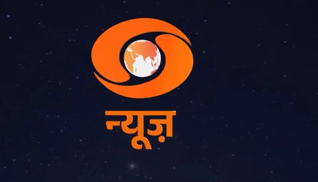
Doordarshan, India’s esteemed public broadcaster, has ignited a storm of controversy with its recent logo makeover, transitioning from its iconic red hue to a striking orange shade. The unveiling of this new emblem has sparked criticism from various quarters, particularly from Trinamool MP Jawhar Sircar, the former head of Doordarshan’s parent organization. Sircar lambasted the move as “inappropriate,” expressing concerns over what he perceives as the “saffronisation” of the logo, especially considering its timing just ahead of elections.
The shift in color palette has raised eyebrows online, with many users interpreting the vibrant orange as a symbol of saffron, a color often associated with Hindu nationalism. This interpretation has fueled speculation about potential political motives behind the rebranding, particularly given its proximity to upcoming elections. Sircar’s critique, echoing sentiments of alarm, highlights the significance of Doordarshan’s role as a national broadcaster and the implications of such visual transformations on its identity and neutrality.

In response to the backlash, Gaurav Dwivedi, the current head of Prasar Bharati, the governing body of Doordarshan, defended the decision, attributing it to a pursuit of enhanced visual aesthetics and branding appeal. Dwivedi emphasized that the chosen color is indeed orange, not saffron, and asserted that the logo redesign is part of a broader overhaul encompassing upgraded equipment and a refreshed visual identity. Despite Dwivedi’s reassurances, the controversy surrounding Doordarshan’s logo metamorphosis underscores the delicate balance between aesthetic innovation and political symbolism in the realm of public broadcasting.